Company Style Guide
Back to Style Guide home.
Options
Quote Block
"Lorem ipsum dolor sit amet, consectetur adipiscing elit. Quisque tristique mauris a dui ultricies, eu feugiat ligula aliquam. Donec id mattis mauris. Vivamus non eros neque. Aenean convallis magna id mattis aliquam. Quisque at tellus et ante ultricies facilisis a non tortor. Mauris ut justo volutpat, posuere eros vel, fringilla leo. Maecenas tempus purus nec nisl feugiat."
Dr. Very Important
<div class="quote-block">
<p class="quotation">"Lorem ipsum dolor sit amet, consectetur adipiscing elit. Quisque tristique mauris a dui ultricies, eu feugiat ligula aliquam. Donec id mattis mauris. Vivamus non eros neque. Aenean convallis magna id mattis aliquam. Quisque at tellus et ante ultricies facilisis a non tortor. Mauris ut justo volutpat, posuere eros vel, fringilla leo. Maecenas tempus purus nec nisl feugiat."</p>
<p class="quote-speaker">Dr. Very Important</p>
</div>
Panels
Different panel options
Panel 1
<div class="hover-shadow content-block">
<a href="#">
<div class="fb fb_7-12">
<div class="text-container">
<h3 class="sub-title color-secondary">Epigenetics Blog</h3>
<p class="para">Follow our posts about the latest trends in epigenetics research.</p>
<div>
<div class="img">
<img src="/uploads/images/web_site/resources-page/home-page-brochures-thumb.jpg">
<div>
</div>
</a>
</div>
Panel 2
<div class="hover-shadow content-block type-1">
<a href="#">
<div class="img">
<img src="/uploads/images/web_site/LightSwitch/Promoter-3.jpg">
<div>
<div class="text-container">
<h3 class="sub-title color-secondary">Promoter Reporter GoClone Controls</h3>
<p class="para">The LightSwitch system contains many positive and negative promoter controls to optimize experimental conditions and normalize for non-specific effects.</p>
<div>
</a>
</div>
Panel 3
Active Motif provides a wide range of products and services for transcriptional regulation research including Transcription Factor Activity Assays and over 18,000 pre-cloned human promoters and transcription factor response elements.
Learn More
<div class="aname-nav content-block type-3">
<a href="/catalog/1249/transcriptional-reg">
<div class="img">
<img src="/uploads/images/web_site/genereg-services/GeneReg-v1.jpg">
</div>
</a>
<div class="aname-text-container">
<div class="aname-head-container">
<a href="/catalog/1249/transcriptional-reg" class="aname-head">
<span class="aname-sub">Transcriptional Regulation</span>
</a>
</div>
<p class="aname-sub">Active Motif provides a wide range of products and services for transcriptional regulation research including Transcription Factor Activity Assays and over 18,000 pre-cloned human promoters and transcription factor response elements.</p>
<p class="aname-links">
<p href="/catalog/1249/transcriptional-reg"> <strong>Learn More</strong></a>
</p>
</div>
</div>
Panel 4: aname-nav
<div class="aname-nav">
<div class="fb fb_10-12">
<div class="aname-head-container">
<a href="/catalog/696/methylated-dna-enrichment" class="aname-head">
<span>Methylated DNA Enrichment</span>
</a>
</div>
<div class="icon-container">
<img src="/uploads/images/web_site/featured-products/NuQ-v2-178x108.jpg">
</div>
<p class="aname-sub">Here are some words that will explain what this category is. Maybe it's longer like this.</p>
<p class="aname-links">
<a href="/catalog/736/medip">Option 001</a>
<a href="/catalog/699/hmedip">Option 002</a>
<a href="/catalog/775/hydroxymethyl-collector">Option 003</a>
<a href="/catalog/43/methylcollector-ultra">Option 004</a>
</p>
</div>
</div>
Accordion
<section class="accordion-collapse">
<h4 class="collapse-handle">"Accordion Demo"</p>
<div class="collapse-content">
<p class="quote-speaker">Welcome to Active Motif</p>
</div>
</section>
OR you don't have to use a SECTION tag, you can use a DIV too
<div class="accordion-collapse">
<h4 class="collapse-handle">"Accordion Demo"</p>
<div class="collapse-content">
<p class="quote-speaker">Welcome to Active Motif</p>
</div>
</div>
Images
Current Image Pattern
- All images in bespoke articles, center and right column are now 100% width overriding the width set in it's attribute
When adding an image the main things to focus on are:
- The image size, large or small?
- is the image inside of an anchor tag?
An example of the wrong way:
<div class="center">
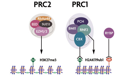
<img width="425" height="259" alt="Polycomb complexes and subunits" src="/images/products/target_stem_cell_2.jpg">
</div>
There are a few reasons this is the wrong thing to do:
- By default without the 100% width added, the image would be fixed at 425px even when the screen size is less.
- With the 100% applied by default the image will stretch and looked pixelated, or of a lesser quality.
The best way to cater for this, is to apply to any images the following.
<div class="center">
<img style="max-width: 425px;" alt="Polycomb complexes and subunits" src="/images/products/target_stem_cell_2.jpg">
</div>
You'll notice the image never exceeds 425px even though it's set by default to 100%. The optional class of center is there to wrap the image just for consistent presentation but you can remove that if you need too.
Images in anchors
There are exceptions where the image width won't go to 100% but you still require the max-width style applying.
<div class="center">
<a href="#">
<img style="max-width: 425px;" alt="Polycomb complexes and subunits" src="/images/products/target_stem_cell_2.jpg">
</a>
</div>
Because anchors on the site are display inline by default the anchor tag will not stretch to 100% of it's container. The image will stretch to 100% of the anchors size and so the image will not need any max width styling thanks to this example:
Buttons
Each of these buttons stretch to fit the area they reside except for bttn-main
Button Full Chevron
<a href="#" class="bttn-full-chevron">Button Full Chevron</a>
OR: if you want to use Javascript to click event
<div class="bttn-full-chevron">Button Full Chevron</div>
Button Full Chevron
Button Full Chevron 2
<a href="#" class="bttn-full-chevron-2">Button Full Chevron</a>
OR: if you want to use Javascript to click event
<div class="bttn-full-chevron-2">Button Full Chevron</div>
Button Full Chevron
Button Full Chevron
<a href="#" class="bttn-full-chevron large">Button Full Chevron Large</a>
OR: if you want to use Javascript to click event
<div class="bttn-full-chevron large">Button Full Chevron Large</div>
Button Full Chevron Large
Button Main
<a href="#" class="bttn-main">Button Main</a>
OR: if you want to use Javascript to click event
<div class="bttn-main">Button Main</div>
Button Main
Icons
In order to create icons for the site but still keep things optimised gulp iconfont was used. These icons are ready to use by adding classes to any dom element.
Examples
<div class="if if-cart"></div>
<div class="if if-chevron-down"></div>
<div class="if if-chevron-left"></div>
<div class="if if-chevron-right"></div>
<div class="if if-chevron-up"></div>
<div class="if if-cross"></div>
<div class="if if-facebook"></div>
<div class="if if-linkedin"></div>
<div class="if if-loader-1"></div>
<div class="if if-remove"></div>
<div class="if if-search"></div>
<div class="if if-twitter"></div>
You can use them in your text, or for links and change their colour & size
<div style="font-size: 30px;">
<div class="color-primary-dark if if-cart"></div>
<div class="color-grey if if-chevron-down"></div>
<div class="color-secondary if if-chevron-left"></div>
<div class="color-primary-light if if-remove"></div>
<div class="color-primary if if-search"></div>
<div class="color-secondary-light if if-twitter"></div>
</div>
YouTube
The youtube iframes by default have a fixed width and height just like images.
To tackle this we add a wrapper div with a class that scales the youtube video at a ratio. This also overrides the width and height attributes.
<div class="youtube-wrap">
<iframe src="//www.youtube.com/embed/bTeo1aMarSE "
allowfullscreen="" width="480" height="315"frameborder="0"></iframe>
</div>
Example
Margin and Padding
For consistency there are 5 sizes for padding and margin which can be applied in different ways
Directional
- margin-top-normal
- margin-right-normal
- margin-bottom-normal
- margin-left-normal
- padding-top-normal
- padding-right-normal
- padding-bottom-normal
- padding-left-normal
Margin example using size variants which can also be applied to padding.
<div class="margin-top-smallest">margin-top-smallest<div>
<div class="margin-top-small">margin-top-small<div>
<div class="margin-top-normal">margin-top-normal<div>
<div class="margin-top-large">margin-top-large<div>
<div class="margin-top-largest">margin-top-largest<div>
There are also vertical and horizontal options:
- margin-y-normal
- margin-x-normal
- padding-y-normal
- padding-x-normal
<div class="margin-bottom-normal border-dark padding-y-largest">
<div class="bg-grey-light center">Padding Y Largest 40px Vertical</div>
</div>
Padding Y Largest 40px Vertical
There are 2 other margin and padding helpers which override everything to set a value of zero
Other Helper Classes
There are a number of helper classes which can be used in the CMS which also help to retain consistency especially when global changes are required.
Opacity
<h2 class="op-100">Opacity 100<h2>
<h2 class="op-90">Opacity 90<h2>
<h2 class="op-80">Opacity 80<h2>
<h2 class="op-70">Opacity 70<h2>
<h2 class="op-60">Opacity 60<h2>
<h2 class="op-50">Opacity 50<h2>
<h2 class="op-40">Opacity 40<h2>
<h2 class="op-30">Opacity 30<h2>
<h2 class="op-20">Opacity 20<h2>
<h2 class="op-10">Opacity 10<h2>
<h2 class="op-0">Opacity 0<h2>
Opacity 100
Opacity 90
Opacity 80
Opacity 70
Opacity 60
Opacity 50
Opacity 40
Opacity 30
Opacity 20
Opacity 10
Opacity 0
Indenters
Were actually created for the code blocks to format the lines of html
<div class="indent-1">Indented by 10px<div>
<div class="indent-2">Indented by 20px<div>
<div class="indent-3">Indented by 30px<div>
<div class="indent-4">Indented by 40px<div>
<div class="indent-5">Indented by 50px<div>
<div class="indent-6">Indented by 60px<div>
<div class="indent-7">Indented by 70px<div>
<div class="indent-8">Indented by 80px<div>
<div class="indent-9">Indented by 90px<div>
<div class="indent-10">Indented by 100px<div>
<div class="indent-11">Indented by 110px<div>
<div class="indent-12">Indented by 120px<div>
Examples
Normal
Indented by 10px
Indented by 30px
Indented by 60px
Indented by 90px
Borders
<div class="border-lightest">Border Lightest<div>
<div class="border-light">Border Lightest<div>
<div class="border">Border Lightest<div>
<div class="border-dark">Border Lightest<div>
<div class="border-darkest">Border Lightest<div>
Examples
Border Lightest
Border Light
Border Normal
Border Dark
Border Darkest
Center
<div class="center">Centered Text<div>
Centered Text
Block
<a href="#" class="block">Display Block<a>
Display Block
 Cart
Cart Products


